I’ve been trying to find a good workflow for drawing vector artwork that has the spontaneity and roughness of hand drawn images.
Since my digital medium of choice is the web, that means SVG is the only output format in town. Which is perfect, since like everybody, I never liked choice anyway.
Preamble Ramble
There’s some interesting experiments with giving programmatically drawn SVGs a hand drawn quality, but I want to have the artistic freedoms that come with actually drawing the images by hand, not just the feel of being hand drawn.
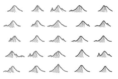
I need a vector drawing program, but that’s where everything falls apart. In my experience, there’s no drawing tool that combines the expressiveness of drawing freehand that also natively handles SVG, or even reliably outputs it.
Sure, Inkscape and Illustrator provide a lot of power, but they feel more like drafting tools, not drawing tools. I want the experience of drawing something free-hand, without constraints or planning or thinking about the geometry.
The situation has me pining for the bad old days of Macromedia Flash, which, everything else aside, still had the best vector drawing tool for my money.
You could draw all the regular geometry that modern apps offer, but you could also draw free hand. If you drew a closed shape free hand, the tool would recognize the shape, allowing you to apply transforms or color it in with a click.
Yet as much as I look back at the time of Flash with rose-colored glasses, it also sucked. For one, you had to draw with a mouse, since this was before the days of good, relatively cheap touch screens. That made the “free-hand” not quite free; mouse-hand, more like. The lines didn’t look the same.
These days I have access to a iPad with an Apple Pencil, so I could draw my lines there, then convert them to SVG. In fact, that feature is built into several popular drawing applications.
Still, I was curious about a fully hand drawn approach. I’m also a software developer, so I decided to try a workflow that at the same time involved a lot less digital technology and more command line. Both sides were happy.
The Workflow
I drew my image traditionally, with a pencil on paper, in black and white, took a picture of it, did some image processing, converted that to SVG, then imported it into an SVG editing application for coloring.
So far, I don’t hate this process.
I started by drawing a lot of doodles using a drawing pencil and a “light touch”. By light touch, I mean that I tried not to bore down on the pencil stroke, and keep my lines light and “exploratory”, as my wife put it. This let me keep figuring out the drawing as I drew, without being married to anything other than my wife.
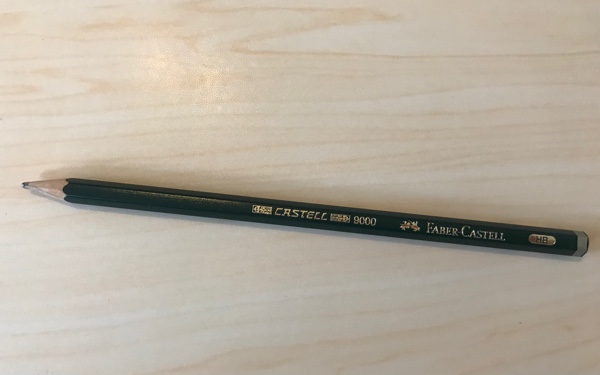
I kept my doodles unrelated, just drawing whatever I felt my lines were creating already.
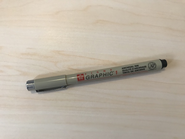
Once I was happy with that, I used one of my wife’s fancy inking pens to make a clear, dark line over my pencil strokes. The pencil was still visible underneath the ink, but there was no mistaking where the “real” line was.
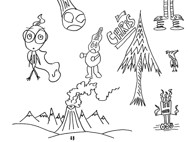
I took that drawing, and photographed it on my iPhone 7 camera with as bright light as I could manage. In fact, it’s the same image (at a higher resolution) as seen below.
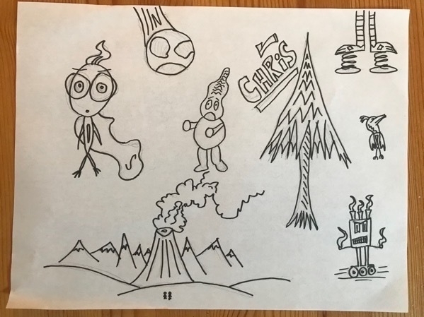
I took that image and copied it to my Mac Mini, then into Acorn, which is a streamlined, Mac-centric version of Photoshop that I find easier to use. I adjusted the color levels to omit as many of the smudgy greys from the paper and the pencil strokes as possible, while keeping the ink lines relatively dark.
Then, I switched the graphic to black and white (as distinct from gray
scale; every color is either black or white). I played with those
“sharpness” levels until all the remaining pencil lines were white, and
the ink lines were pure black. I saved the result, below, as a .bmp
file, for reasons that will become momentarily apparent.
Remember that big .bmp mystery from just now? I mean, why save it as
such an archaic file type? Because it’s an uncompressed image type, so
no data is lost, but more importantly, it’s what Potrace,
the bitmap to vector conversion tool, expects (it can also ingest .pnm
files as well, but honestly I have no idea what those are and I haven’t
been bothered to look them up).
Potrace is an open source tool used at the command line, that is also part of other commercial and non-commercial software, such as the afore mentioned Inkscape. I actively enjoy the command line, so I don’t mind the “unglamorous” interface.
potrace --backend svg my-image.bmp --output my-image.svg
I told the program to output SVGs (it can also do EPS and Postscript), and it worked flawlessly. It only operates on black and white images, but I already knew that so everything was going just fine.

Next step, color. I opened my new SVG in Boxy SVG, which is a simple program that natively handles SVGs.
Since I had lots of doodle “subjects” in my initial drawing, I decided to focus on the character in the upper left with the cape, which I called “Super Wisp”.
If this was Flash, I could have just used the paint bucket tool to fill
in each contiguous shape. However, with all the SVG tools I’ve used,
the shape has to use <polygon>, <ellipse>, or the like under the
hood to fill in shapes with a click (the programs just attach a fill
property to the element). Auto-generated SVG code, like the output of
Potrace, almost always draw with simple <path> elements, which are
hard if not impossible to fill with color.
Instead, my plan was to draw shapes of the same dimensions as the lines it is meant to fill in, give them a background color, then move them behind the lines in the layer view.
I started coloring by making a green ellipse for the head. The head I drew was not a perfect ellipse, so the background color poked out on the edges. However, I felt it added a certain rough feel, like in cheap comics where the color printing is not that exact.
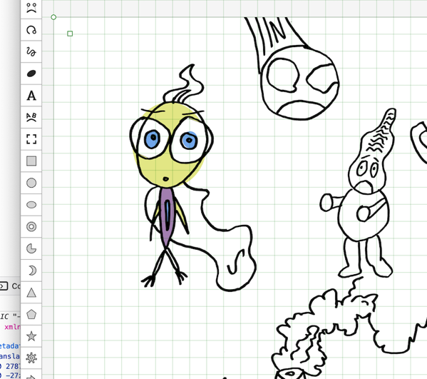
The sloppy, overflowing color look was all well and good, but at the risk of being anti-creative, could I color inside the lines?
Turns out: yes. I used the polygon tool to draw points in an angular version of the shape I wanted to color in.
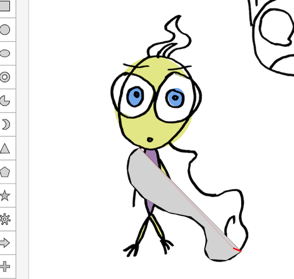
Once I put the finished shape behind the lines, the lines obscured the pointy edges of the polygon, creating the illusion of continuous color.
Unfortunately, my results weren’t perfect on the first drawing—it was hard to tell if my polygon edge would fall exactly on the line, especially near the top—as illustrated, below.
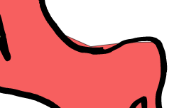
Fortunately, Boxy SVG provides excellent shape transform tools. I was able to adjust geometry points until the shape fell inside the lines how I wanted.
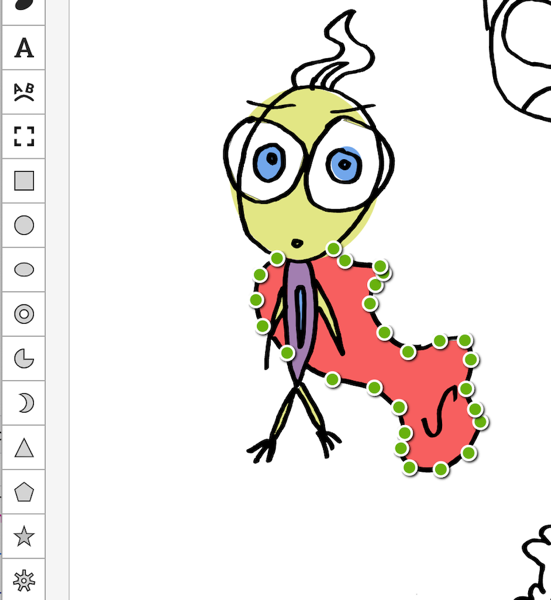
Once I was happy with my color, I selected only my colored-in Super
Wisp character, and exported it. For a drawing with the kind of
irregularities of hand drawn, I was expecting a semi-large file size,
but it ending up weighing in at only 64k on disk. This is before optimizations and minification, so the raw SVG code looked like this:
<?xml version="1.0" encoding="utf-8"?>
<svg viewBox="444.783 273.522 749.717 1341.237" xmlns="http://www.w3.org/2000/svg">
  <g>
    <title>Super Wisp</title>
    <g>
      <title>Color</title>
      <polygon style="stroke: rgb(0, 0, 0); fill: rgb(248, 106, 106);" points="601.655 994.655 551.522 1042.12 540.507 1115.09 559.784 1190.82 630.653 1268.49 761.935 1345.18 883.477 1369.06 954.659 1425.66 971.182 1500.33 960.166 1544.39 984.7 1600.03 1075.78 1605.45 1156.2 1557.99 1190.15 1467.87 1175 1431.5 1148.84 1372.3 1162.53 1287.74 1145.36 1232.1 1072.32 1233.48 984.195 1260.366 912.535 1209.34 870.519 1125.57 886.312 1071.31 909.719 1036.88 900.081 1017.6 798.189 1001.08 765.143 966.659"/>
<!-- The real code keeps going, but one can only stare at so much XML. -->
I ran the file through Svgcleaner, and it cut the file
size by more than half, down to 31k! Now the code looked like this:
<svg viewBox="444.783 273.522 749.717 1341.237" xmlns="http://www.w3.org/2000/svg"><path d="m601.655 994.655-50.133 47.465-11.015 72.97 19.277 75.73 70.869 77.67 131.282 76.69 121.542 23.88 71.182 56.6 16.523 74.67-11.016 44.06 24.534 55.64 91.08 5.42 80.42-47.46 33.95-90.12-15.15-36.37-26.16-59.2 13.69-84.56-17.17-55.64-73.04 1.38-88.125 26.886-71.66-51.026-42.016-83.77 15.793-54.26 23.407-34.43-9.638-19.28-101.892-16.52-33.046-34.421z" fill="#f86a6a" stroke="#000"/>
<!-- Enough of this; the only thing worse than starting at too much XML is starting at too much minified XML. -->
Here it is, the finished SVG, embedded directly into this page, in all it’s sloppy glory.
There’s still lots of imperfections, which really stretch the limits of what can be called artistic roughness, which are especially noticeable at larger screen sizes. Yet ultimately, I found the test successful. To me, the image has charm and personality, and as my psychologist warned, came directly from me.
The workflow isn’t perfect, but it’s very workable. The whole process took me only a couple of hours, and this was my first time doing it. I’m excited to keep exploring.