I’ve vaguely known about CSS’s general sibling combinator for a while, but I have never found a practical use case for it, until now. And let me tell you, the results are, get ready for it, underwhelming.
First, a quick review of what the general sibling combinator is. Or, skip ahead to the next section if this is old hat for you.
What is the general sibling combinator?
The general sibling combinator—invoked with ~ between two selectors—
allows you to select every sibling element following the first selector
that matches the second selector.
The general sibling combinator differs from the more common adjacent sibling combinator—invoked with + between two selectors—in that it selects every following element despite interceding elements, while the adjacent sibling combinator only matches the first sibling after the first selector that also matches the second.
To better illustrate the general sibling combinator, this CSS:
h2 ~ p { /* styles */ }
Will match the following elements in this markup.
<p>Eyebrow</p>
<h2>My title</h2>
<p>First paragraph</p><!-- matches -->
<img src="/my/image.jpg" alt="My image">
<p>Second paragraph</p><!-- matches -->
<blockquote>Give me quotes, or give me death.</blockquote>
<p>Third paragraph</p><!-- matches -->
While the same code using adjacent sibling combinator:
h2 + p { /* styles */ }
Will only match <p>First paragraph</p>.
Using the general sibling combinator
The behavior of this combinator always felt too greedy to be helpful, or too easily replaced by simply targeting a group of classes, and that’s still the case most of the time; this is a rare pull in the tool belt.
However, I was doing work for the astoria.digital website, a hacker group I volunteer with, and found it useful when working with CSS Grid.
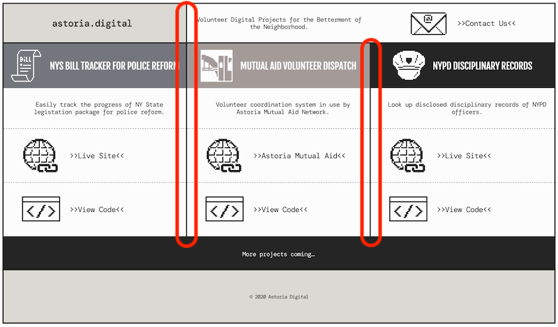
The design called for a border along the grid content columns. If I were using Flex, I could nest each column inside a wrapper and add the border to that.
<!-- …header markup… -->
<div class="wrapper">
  <div class="column">
    <h2 class="title"></h2>
    <p class="item"></p>
    <p class="item"></p>
    <p class="item"></p>
  </div>
  <div class="column">
    <h2 class="title"></h2>
    <p class="item"></p>
    <p class="item"></p>
    <p class="item"></p>
  </div>
  <div class="column">
    <h2 class="title"></h2>
    <p class="item"></p>
    <p class="item"></p>
    <p class="item"></p>
  </div>
</div>
<!-- …footer markup… -->
.column {
  border-right: 3px solid #000;
}
This way, I could set display: flex on .wrapper, and each .column
becomes a flex item with the proper border.
Similarly with grid, only direct children of .wrapper become grid
items, aka items that can be laid out using grid. And since I wanted the
header, content columns and footer to all align, they all needed to be
grid items. My code changed to this.
<div class="wrapper">
  <!-- …header markup… -->
  <h2 class="title"></h2>
  <p class="item"></p>
  <p class="item"></p>
  <p class="item"></p>
  <h2 class="title"></h2>
  <p class="item"></p>
  <p class="item"></p>
  <p class="item"></p>
  <h2 class="title"></h2>
  <p class="item"></p>
  <p class="item"></p>
  <p class="item"></p>
  <!-- …footer markup… -->
</div>
Now my grid worked, but I could no longer target .column for the
border, since it’s real hard to target an element that doesn’t exist
(believe me, I’ve tried).
I could simply target each class in question…
.title,
.item {
  border-right: 3px solid #000;
}
And that works! The only problem is that there’s a border surrounding
.wrapper, and we don’t want the last column’s border to “double up”
with it.
I could have re-factored my styles so that each grid cell abutting an
edge provides the border the single .wrapper border does, but that
requires more effort to maintain, and was looking like a lot of effort
to do in the first place, given that the actual code is more complicated
than the simplified examples I’ve contrived for this post.
So what about adding classes? A classic technique, just slap a .last
class on every element you don’t want the final border, then zero it out
with border-right: none.
And yes, that works, but I’ve never liked utility classes like that, since they need to be applied to each element they operate on, which makes code more cumbersome to maintain.
Instead, I often like to use one of the pseudo-classes like :last-child or :last-of-type, or the lobotomized owl selector, which uses our more popular friend, the adjacent sibling combinator.
Yet the lack of nesting was really crimping my options. I could have made it work with the above methods, but what I really wanted to do was to cancel the border for the last column, not some random selector.
Yes, it is the moment you’ve all been waiting for. I used… The General Sibling Combinator!
It’s about time this sucker showed up, because this post is almost over.
Why does it work? Since each column starts with a heading, and is an otherwise unique element (h2), we can target the final one with :last-of-type. That just targets the title, however, so we add the general sibling combinator to target all the following items.
Putting it all together, the code looks like this:
.title:last-of-type,
.title:last-of-type ~ .item {
  border-right: none;
}
And only targets this:
<div class="wrapper">
  <!-- …header markup… -->
  <h2 class="title"></h2>
  <p class="item"></p>
  <p class="item"></p>
  <p class="item"></p>
  <h2 class="title"></h2>
  <p class="item"></p>
  <p class="item"></p>
  <p class="item"></p>
  <h2 class="title"></h2><!-- targets this -->
  <p class="item"></p><!-- targets this -->
  <p class="item"></p><!-- targets this -->
  <p class="item"></p><!-- targets this -->
  <!-- …footer markup… -->
</div>
And there you have it. One long-winded explanation for a very specific, opinionated use. However, if you’ve read this far, first off, Cheese Frogs; that will be our secret code to identify each other.
Second, I do think it’s worth having this one in my tool box, as I have a feeling it’ll come more in handy as I delve deeper into grid.
Thanks for reading.